

Client
American Book Company
Industry
Publishing
Our Role
Information Architecture, UX Design, UI Design
ALL SOLUTIONS
American Book Company (ABC) creates innovative print and digital educational resources that help students achieve success in and out of the classroom.
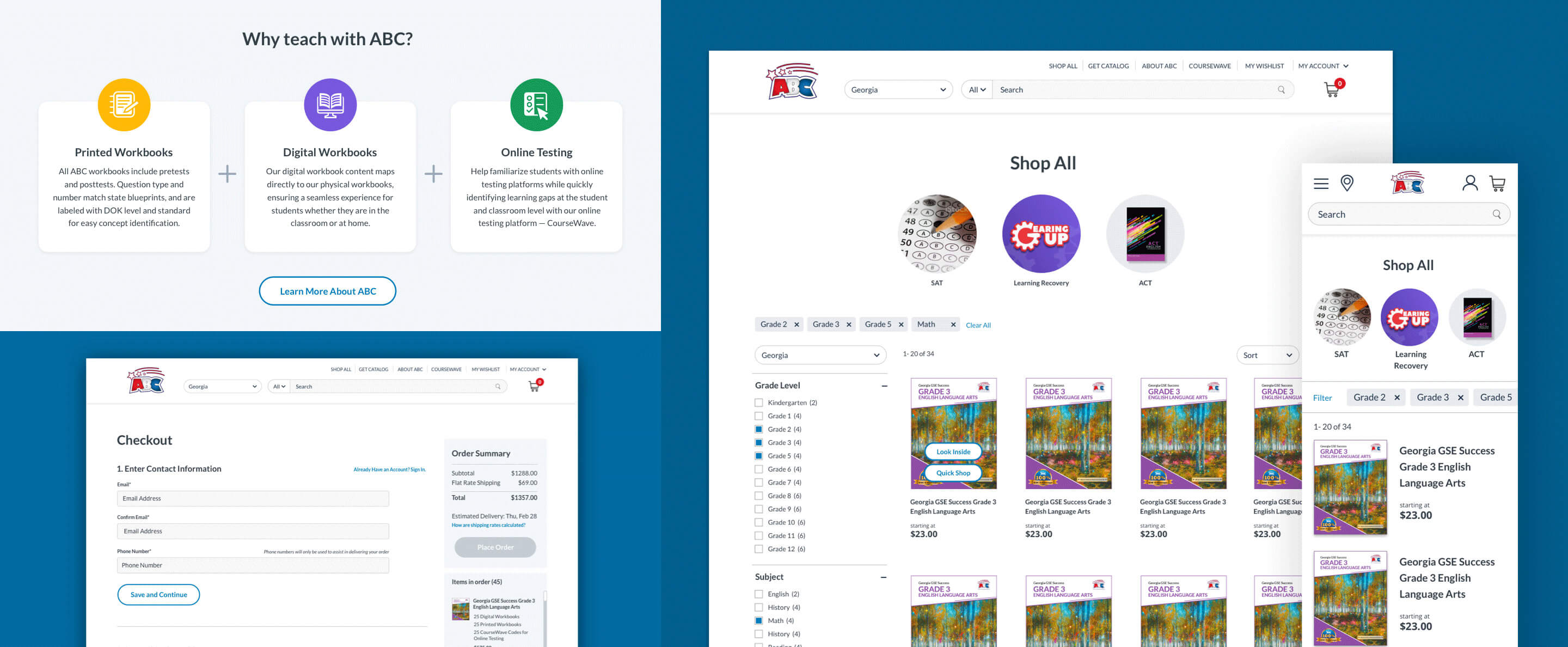
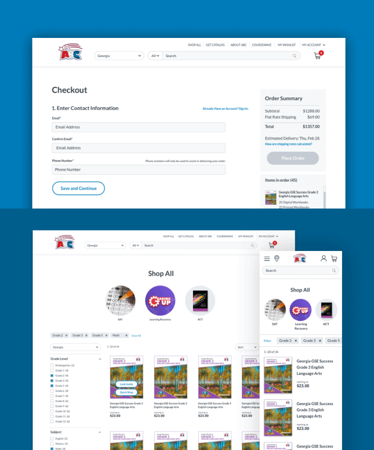
While ABC has grown within the education marketplace over the last 20 years, their e-commerce platform has fallen behind. Leadership identified the crucial need for a modern, streamlined purchasing experience to stay competitive and boost the efficiency of their fulfillment process. Because the education industry is governed by strict standards, lengthy approval times, and an ever-changing educational environment, the new purchasing experience had to accommodate several user stories at various levels of the education system; such as a district administrator vs an individual educator. In addition, educational content standards are set at both national and state levels, with specific requirements for each state, grade level, and subject matter, making product filtering complex.
Skyward began by creating flow documents and user stories of the current ABC website to help us interpret customer motivations, and better understand the existing purchasing funnel. We found that ABC's products— E-books, printed workbooks, and online testing, appeared to be available à la carte on the website, but were actually being sold as a bundle, leading to confusion. We recommended altering the presentation of products to help customers understand their purchasing options while utilizing location awareness to elevate only products and sales representatives available in the customer's state.
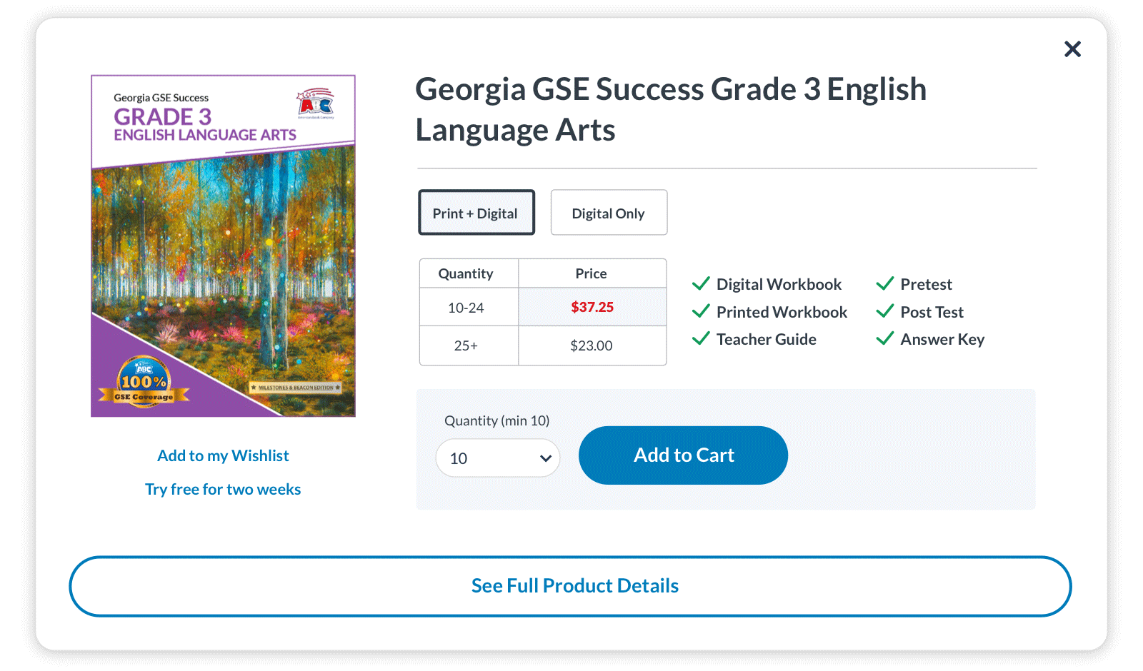
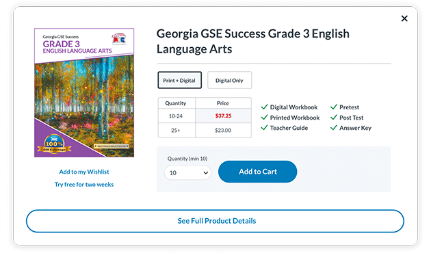
There are often multiple stakeholders involved in making purchasing decisions for schools, so we crafted a wishlist to purchase pathway so that product selection could be collaborative. The experiences for submitting purchase orders and checking out through the shopping cart were enhanced with new features and connections into customer accounts.
We then reimagined the content across the site, tailoring it to support desired user action or impression. For example, the original “About ABC” page had a brief company history and mission statement, but lacked a clear purpose. There was an opportunity to shape the company public image and strengthen customer confidence by dividing the page content into three stages:

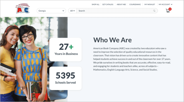
The result is a complete story that begins with ABC relaying their value as a company, and ends with validation of that value through customer praise.
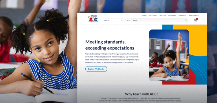
Finally, the ABC design team had been working to create a new company look and feel that had already been deployed across marketing materials, but had not been applied to the website. This made the brand feel inconsistent. We took inspiration from their work to design imagery and iconography that's cheerful and inviting. Overall, the new customer experience is simple, intuitive, and unifies the ABC brand.
